
Data visualization is a crucial skill for marketers in today's data-driven world. Transforming raw data into understandable and actionable insights is essential for effective decision-making. This post outlines best practices for creating compelling and informative data visualizations tailored for marketing purposes.
Understanding Your Audience and Objectives
Before creating any visualization, define your target audience and the message you want to convey. Consider their level of familiarity with data and tailor the complexity accordingly. Are you presenting to executives, other marketers, or a general audience? What key takeaways should they grasp?
- Define your audience: Who are you trying to reach?
- Determine your objective: What message do you want to communicate?
- Identify key metrics: Which data points are most relevant to your objective?
Choosing the Right Chart Type
The type of chart you select significantly impacts how effectively your data is communicated. Different chart types are suited for different purposes. Here's a guide:
- Bar Charts: Ideal for comparing categorical data. Use them to showcase sales performance by region, product category, or marketing channel.
- Line Charts: Best for displaying trends over time. Visualize website traffic, lead generation, or revenue growth over months or years.
- Pie Charts: Effective for showing proportions of a whole. Use them to represent market share, budget allocation, or customer demographics.
- Scatter Plots: Useful for identifying correlations between two variables. Explore the relationship between marketing spend and customer acquisition.
- Heatmaps: Great for visualizing data across two dimensions, revealing patterns and correlations. Use them to analyze website user behavior or email marketing engagement.
Designing for Clarity and Impact
A visually appealing and easy-to-understand chart is more likely to capture and retain your audience's attention. Follow these design principles:
- Keep it Simple: Avoid clutter and unnecessary elements. Remove distracting gridlines, labels, and excessive colors.
- Use Clear Labels and Titles: Ensure axes, data points, and the overall chart are clearly labeled. Titles should accurately describe the data being presented.
- Choose Colors Strategically: Use color to highlight key data points and create visual hierarchy. Avoid using too many colors, which can be overwhelming. Consider using brand colors for consistency.
- Maintain Proper Scaling: Ensure axes are scaled appropriately to avoid distorting the data. Start the y-axis at zero when appropriate to prevent misleading interpretations.
- Tell a Story: Structure your visualization to guide the viewer through the data, highlighting key insights and drawing conclusions.
Ensuring Data Accuracy and Integrity
Data visualizations are only as reliable as the data they represent. Ensure your data is accurate, up-to-date, and properly sourced.
- Verify Data Sources: Double-check the accuracy of your data and ensure it comes from reliable sources.
- Clean and Preprocess Data: Remove errors, outliers, and inconsistencies from your data before visualizing it.
- Cite Your Sources: Properly attribute the data sources used in your visualization to maintain transparency and credibility.
Examples of Effective Data Visualizations in Marketing
Let's look at some concrete examples of how data visualization can be applied in marketing:
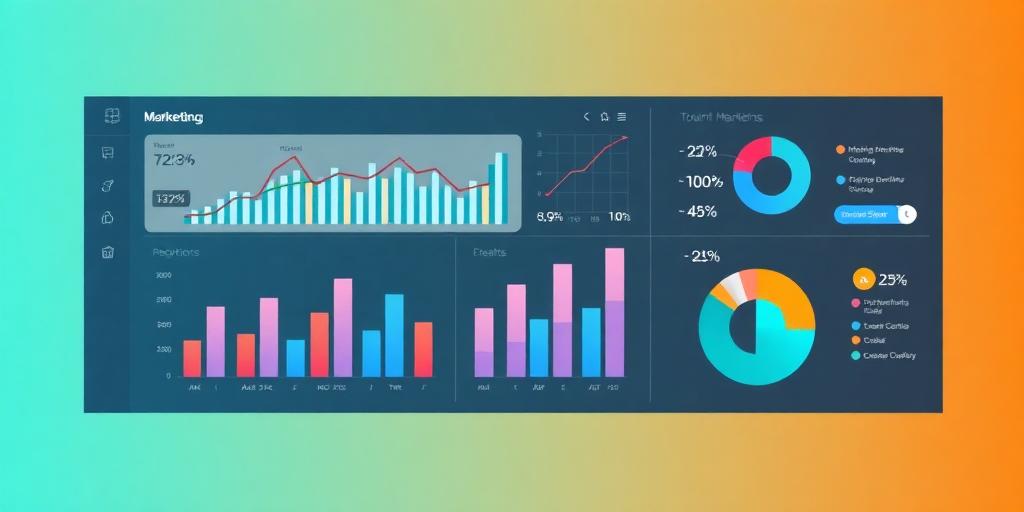
- Marketing Campaign Performance Dashboard: A dashboard that tracks key metrics like impressions, clicks, conversions, and ROI for different marketing campaigns.
- Customer Segmentation Analysis: Visualizing customer data to identify distinct segments based on demographics, behavior, and preferences.
- Website Analytics Report: Charts and graphs showing website traffic, bounce rate, time on page, and other key metrics to assess website performance.
- Social Media Engagement Report: Visualizing social media metrics like likes, shares, comments, and follower growth to track social media performance.
Tools for Creating Data Visualizations
Several tools are available to help you create effective data visualizations. Here are some popular options:
- Tableau: A powerful data visualization tool with a wide range of chart types and interactive features.
- Google Data Studio: A free, web-based tool for creating dashboards and reports from various data sources.
- Microsoft Power BI: A business intelligence tool with data visualization capabilities.
- Excel: A widely used spreadsheet program with basic charting capabilities.
- Infogram: A user-friendly tool for creating infographics and data visualizations.
Conclusion
Mastering data visualization is essential for marketers who want to leverage data to make informed decisions and drive results. By following these best practices, you can create compelling and informative visualizations that communicate your message effectively and empower your audience to take action. Embracing data visualization best practices ensures that marketing efforts are grounded in solid data insights, ultimately leading to more successful campaigns and better business outcomes.


